Every year around this time our sample room fills up with what buyers are asking for next, and 2026 is shaping up to be less about new finishes and more about honest structures. Regulation is doing some of the pushing. So is a fatigue I keep hearing from brand teams: too much foil, too much gloss, too many claims that fall apart the moment a curious customer reads the back of the box. Here are the seven trends I would actually plan around this year — and for each, a way in that will not blow up a small budget.
1. Refill mechanisms stop being a gimmick
Refillable packaging has been a trade-show headline for a few years. What changes in 2026 is the enforcement backdrop: the EU's packaging and packaging waste regulation — Regulation (EU) 2025/40 — entered into force in February 2025, with its main obligations applying from August 2026 and reuse and refill-related targets tightening through the decade. Brands selling into Europe are suddenly designing refills as compliance strategy, not just as marketing.
What it looks like on the shelf: outer vessels built to last — a weighty jar, an aluminum or rigid-plastic compact — with replacement pods or inner cups sold separately. The design work shifts to the mechanism: the inner must seat positively, release cleanly, and read as premium on its own, because the refill pod is now a product in your lineup, not a spare part. Expect the packaging copy to change too, from "refillable" as a feature to instructions that assume the customer will actually come back for the pod.
For smaller brands: you do not need a proprietary magnetic pod system. Start with one hero SKU — the product customers rebuy most — in a container that accepts a simple drop-in inner. Sell the refill at a lower price with minimal secondary packaging. The economics work because the second purchase ships less packaging than the first.
2. Mono-material structures
A pump bottle with five plastic types is a recycler's nightmare no matter how green the label says it is. Mono-material design — the whole component made of one polymer family, so it can actually enter a recycling stream — keeps gaining ground, and the PPWR's design-for-recyclability requirements phasing in toward 2030 are the reason brands are moving now rather than later.
The practical frontier is tubes. A mono-material PE tube, including the shoulder and cap, skips the difficult-to-recycle mixed constructions and gives the whole piece one clean material story. We see buyers specifying these not because it photographs well but because their sustainability teams can finally defend the claim line by line.
For smaller brands: a mono-material PE tube is one of the least expensive ways to make a defensible claim, because you are swapping construction, not adding layers. If your current tube is a mixed-material build, this is the swap to price first.
3. Recycled content, printed on the pack
Here is a trend I did not expect to enjoy: brands putting the number right on the pack. "Made with X% post-consumer recycled plastic," stated openly, sometimes with the percentage in the design itself. After years of vague leaf logos, the honest number is becoming the flex.
Why now: recycled-content targets in EU regulation make PCR content a compliance metric, so brands that already source PCR are choosing to show the receipts. Trivium Packaging's Buying Green Report has repeatedly found a strong majority of surveyed consumers willing to pay more for sustainable packaging — and a specific percentage reads as more credible than any adjective.
For smaller brands: our PCR plastic cosmetic tubes can incorporate recycled content at various levels, and printing the figure costs nothing extra — it is an ink change, not a mold change. One caution from the design side: commit to a percentage you can hold across production runs, because a number on the pack is a claim you have to keep.
4. Quieter decoration
Walk a beauty hall and look at what is launching now: less foil, fewer full-gloss laminates, more embossing, debossing, blind patterns, and uncoated stocks. The finish vocabulary is shifting from shine to texture. Part of it is aesthetic — the matte minimal look simply photographs better on social — and part of it is the sustainability math, since less foil and no lamination means a cleaner end-of-life story for the paper.
Debossing is the quiet hero here. A logo pressed into the board, no ink, no foil, catches light through shadow instead of metal, and it removes an entire process cost from the box. Combined with a soft uncoated or lightly coated stock, it reads expensive precisely because it does not shout.
For smaller brands: cut one finish, not everything. Drop the full-sheet laminate, keep a small foil accent. Or replace the foil logo with a blind deboss on your hero SKU and A/B the two on your site. The savings fund the thing most brands actually need, which is a better insert.
| From | To | Why it works |
|---|---|---|
| Foil logo | Blind deboss | Shadow instead of metal; removes an entire process cost |
| Full-sheet gloss laminate | Soft-touch or uncoated stock | Cleaner end-of-life story; matte photographs better |
| Loud gloss surfaces | Deep matte, muted color | Hides scuffs in transit; ages better on a shelf |
5. Paper goes where plastic used to be
Paper engineering keeps eating into plastic's territory: paper tubes for masks and powders, paper-based jars for solids, tubes with paper-adjacent and bio-based structures. It is driven partly by regulation, partly by consumers who now sort packaging weekly and have opinions about it.
Two honest notes from someone who handles these daily. First, paper does not beat plastic at every job — barrier is real, and any supplier promising paper everything for a liquid serum is selling optimism. Second, the wins are genuine where the product suits the material. A sugarcane bio-based tube, for instance, replaces fossil-derived tube plastic with a bio-based alternative while keeping the familiar squeeze format — a swap customers understand instantly, which is more than most sustainability stories can say.
For smaller brands: start where contact is dry or short — powder masks, balms, solid perfumes — and let paper prove itself in your line before you trust it with your most fragile formula.
6. Bamboo and wood, but only with proof
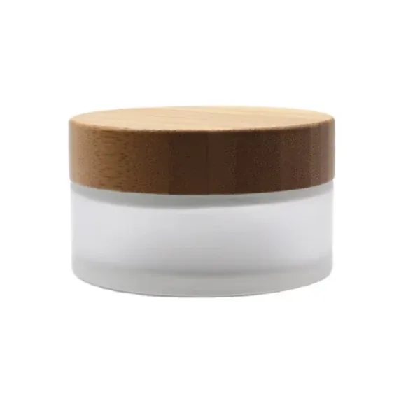
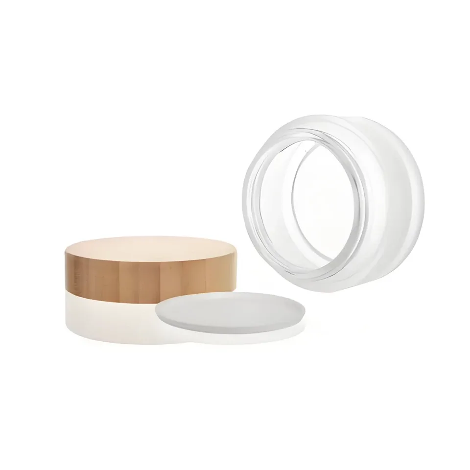
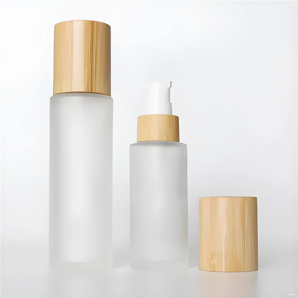
Bamboo never left; the louder version of it did. The 2026 iteration is calmer: bamboo and wood accents on caps, jar lids, and compact housings, paired with very restrained bodies — and critically, sourced with certification rather than vibes. Bamboo details are a story we covered properly in our earlier piece on bamboo cosmetic packaging trends, so I will only say this about where it sits now: the material itself no longer sells. The documented sourcing does. An FSC-certified bamboo cap on an otherwise minimal jar is a claim with a certificate behind it; "natural bamboo" alone is starting to read as greenwashing to anyone paying attention.
For smaller brands: a bamboo lid is a relatively affordable way to add warmth and a sustainability story to an otherwise standard component — a jar with a bamboo cap over a PP or glass body, for example. Ask your supplier for the certification paper before the artwork says "certified," because that is one claim auditors do check.
7. Quiet luxury: matte touch, muted color
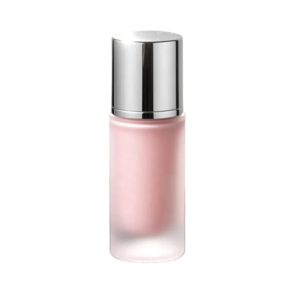
The last trend is barely a product category at all. It is a palette and a touch: low-saturation colors, warm neutrals, deep matte surfaces, soft-touch feels, typography doing the branding instead of effects. It runs through every trend above — refill vessels look like this, mono-material tubes look like this, bamboo caps look like this. The premium signal of 2026 is restraint you can feel.
There is a commercial logic under the aesthetic. Muted colors print more predictably across suppliers and substrates, matte finishes hide scuffs in transit better than gloss, and a restrained pack ages better on a shelf than a trend-colored one.
For smaller brands: this is the cheapest trend on the list. Changing a color story and switching from gloss to a matte or soft-touch finish is a specification change, not a structural one. If you are relaunching in 2026 with a limited budget, start here and let the other six trends arrive at your pace.
Where to begin
None of these seven require a full re-platform. Pick the one closest to a decision you already have to make — a tube that is due for retooling, a holiday set that needs structure, a claim your retail buyer keeps asking about — and start there. Send us the SKU and the direction you are leaning; we will match it against what we run across our plants, quote the realistic options, and get samples to your desk. Trends are only useful once they are on your product, and the sample is where that starts.
| Trend | Main driver | Low-cost entry point |
|---|---|---|
| 1. Refill mechanisms | PPWR reuse and refill direction | One hero SKU with a simple drop-in inner |
| 2. Mono-material structures | Design-for-recycling phasing in toward 2030 | Swap one mixed-material tube for a mono-material PE tube |
| 3. Printed PCR percentage | Recycled content becoming a compliance metric | Print the percentage on the pack |
| 4. Quieter decoration | Aesthetics plus a cleaner end-of-life story | A blind deboss instead of a foil logo |
| 5. Paper where plastic was | Regulation plus weekly sorting habits | Start with dry or short-contact formats |
| 6. Bamboo with proof | Documented sourcing over vibes | One certified bamboo cap on a standard jar |
| 7. Quiet luxury | Matte touch and muted color | A color-story and finish change — no structural work |