The proof came back and the foil looked brassy under D65 light. Not gold — brassy. Under the warm bulbs in our sample room it had read as champagne; under the daylight lamp it was yellow enough to clash with the client's cream carton. We re-mixed the foil shade, ran a second sheet, and the difference was two weeks and one humbled supplier. That is what finishes do. They look simple in a design file and get opinionated in real light.
If you are choosing between hot stamping, spot UV, and soft-touch lamination for a cosmetic box, this is the field guide I wish someone had handed me. All three are workhorses of luxury packaging. All three cost money in different ways and fail in different ways.
Hot stamping: metal, but on paper
Hot foil stamping presses a thin foil film onto the sheet through a heated die. Heat and pressure fuse the foil's lacquer and metal layer to the surface, leaving a crisp, genuinely metallic mark. That is the word to hold onto — metallic, not just shiny. Ink can imitate gold, but it scatters light diffusely. Foil has an actual metal layer and reflects like one. At an angle, a foil-stamped logo on a black rigid box glints in a way ink never will.
The trade-offs start with tooling. Hot stamping requires a die — a brass or magnesium plate cut to your logo's shape — and that die is a real cost with a real lead time. Then the running cost scales with coverage, not just area: foil film is priced by area consumed, and a design that foils a large panel costs far more than a thin logotype, because the foil you press is the foil you pay for. Fine hairlines and small serif type can come out crisp, but complex artwork with tight reverses needs die work and test runs, and very large foil areas on textured stock can show pinholing.
Two combinations worth knowing. Foil plus embossing — pressing the foil through a shaped die so the mark is also raised — is the classic luxury pairing, and it photographs beautifully. And foil over soft-touch lamination works, but only if the film is foil-receptive; standard soft-touch films can reject foil adhesion or produce a mark that scratches off. Ask for a foil adhesion test on the actual laminate before you commit artwork.
Spot UV: gloss as an accent
Spot UV applies a liquid coating through a screen or flexo plate and cures it instantly under UV lamps. Wherever it lands, you get a high-gloss, hard, glass-like layer sitting slightly proud of the sheet. The standard play is matte lamination across the whole box, with spot UV dropped on the logo or a pattern — the gloss catches light and the matte field stays quiet, and the contrast does the design work.
Where does it sit versus foil? Spot UV is tonal, not metallic. It reads as texture and contrast rather than as metal. On dark boards a gloss-black-on-matte-black treatment can look expensive precisely because it is subtle. It also handles fine detail well — small type, dense line patterns — since it is a coating, not a metal film, and there is no foil die, though there is a screen or plate for the pattern. Cost structure is closer to printing than to foil: priced largely by area of application, with plate or screen setup up front, but no metal film consuming meters per box.
The weakness is durability at the edges. Spot UV sits on top of the sheet and, on fold edges and corners of a folding carton, it can crack or flake if the creasing and folding are aggressive. On rigid boxes with fewer folds it is less exposed. Also worth knowing: thick spot UV builds can show slight dimension, which is either a feature (raised UV feels deliberate) or a defect, depending on whether you specified it.
Soft-touch lamination: the finish you feel before you see
Soft-touch — sometimes called tactile or velvet lamination — is a thin film laminated over the printed sheet that gives a suede-like, low-sheen surface. It has quietly become the default feel of premium beauty packaging. Pick up a magnetic closure gift box from any mid-to-high skincare brand and your fingers probably already know the finish.
What it does well: it mutes glare, deepens dark colors (a black under soft-touch looks richer than black under gloss), hides minor scuffs during handling, and gives that instant "this cost more" signal at the shelf. It covers the whole panel, so it flattens the design rather than accenting it — which is exactly why it pairs with spot UV or foil accents rather than competing with them.
The costs and the catches. It is priced by laminated area, on top of the print run, and it adds a step and a day or two to production. The big one for brands is abrasion on high-contact zones: edges, tray slides, anywhere friction constantly rubs can burnish the coating over time, especially in lighter colors. Soft-touch films also vary in how well they accept foil and glue — glue on a soft-touch surface needs the right adhesive or the insert, ribbon, or paper sleeve simply peels away. On a paper sleeve box that slides over a laminated carton, we test the slip and the glue bond on the actual laminated stock, not the printer's swatch book.
The other two finishes, briefly
Matte and gloss lamination sit at the economy end. Matte film gives some of soft-touch's muted look with less of the feel; gloss film makes color pop and wipes clean but reads mass-market on most beauty SKUs. Neither carries the tactile signal of soft-touch, and neither costs as much.
Quick comparison
| Hot stamping | Spot UV | Soft-touch lamination | |
|---|---|---|---|
| Reads as | Metal, glinting | Gloss contrast on matte | Suede, muted, premium |
| Tooling | Die required | Screen/plate required | None special |
| Cost driver | Die + foil area | Plate + coated area | Laminated area |
| Best detail | Fine to medium lines | Very fine lines | Full coverage |
| Watch out for | Shade shifts under daylight; adhesion on films | Edge cracking on folds | Abrasion, glue/foil adhesion |
Dark boards: foil versus ink
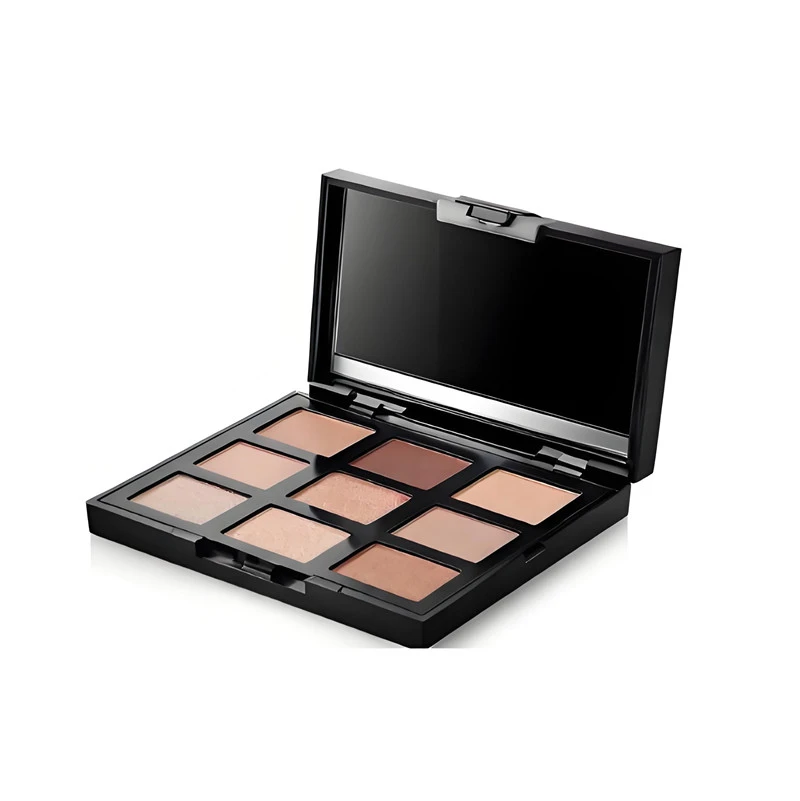
One decision comes up constantly on eyeshadow palettes and black rigid boxes: gold in gold ink, or gold in foil? On a deep navy or black board, printed metallic ink never gets truly bright — the ink's metal pigment is diluted in the vehicle, and the dark substrate absorbs what little it reflects. Foil sits on top of the surface, full metal layer, and stays bright. The nine-pan palette boxes we run for a client use foil purely because ink looked muddy on their plum board. On light boards, metallic inks can be acceptable for broad, low-stakes areas — and they avoid the die cost entirely. The rule I give designers: if the gold has to look like metal on a dark box, foil it. If it just has to read "gold-ish" at shelf distance, ink may do.
How to proof finishes properly
Proofing finishes is a tactile exercise, and it needs your hands, not a PDF.
| Proofing check | How to run it | What it catches |
|---|---|---|
| Light and angle | Tip the sample under D65 daylight and under warm light | Brassy or green shade shifts in foil |
| Adhesion | Fingernail scrape along foil and UV edges; tape pull over a crosshatch | Marks that lift in the shipping carton |
| Fold fatigue | Fold and unfold any flap that moves in use | Spot UV cracking at creases |
| Foil rub on laminate | Rub the foil area on the actual laminated stock | Poor adhesion on soft-touch film |
| Family check | View the sample next to the rest of your SKU family | Shade mismatch across the line |
Get a finished sample on the actual board grade — not a digital mockup, not a coated swatch. Order it the way you would a paper sleeve proof or a rigid box pilot: same stock, same laminate, same foil lot you intend to run. Then do three things. First, tip the box under different light: look at the foil or UV at an angle under daylight and under warm light and check the color you actually get. Second, scrape gently with a fingernail along a foil edge and a UV edge to check adhesion — a mark that lifts under a nail will not survive a shipping carton. Third, fold and unfold any flap that will move in use, because that is where spot UV cracks show up first. If the finish sits on a laminated surface, test the foil rub as well.
One more habit worth building: look at the sample with the rest of your SKU family in the room. A foil that is fine on its own can sit wrong next to last season's shade, and buyers notice family consistency before they notice any single box. None of this takes more than ten minutes, and it has caught every finish problem I can remember.
A note on recycling
Brands ask whether foil ruins the recyclability of the box. The careful answer: hot stamping uses an extremely thin transfer foil, and paper mills generally treat foil-stamped paper as paper with trace foil content in their recovery streams. A heavy plastic overlaminate across the whole sheet is a different story — film on fiber is what genuinely complicates paper recycling, not a foil logo. So the hierarchy I use with clients: foil accents and spot UV on paper are modest concerns; full-sheet plastic lamination is the bigger one, and soft-touch films vary in their recyclability story. If sustainability claims matter to your roadmap — and per our earlier discussion of FSC and fiber claims, they increasingly do — talk through finish choices before the artwork locks, not after the audit question arrives.
| Finish | Durability watch-outs | Recycling note |
|---|---|---|
| Hot stamping | Shade shifts under daylight; adhesion on films | Trace foil content; generally treated as paper |
| Spot UV | Cracks at fold edges on cartons | Coating on paper; a modest concern |
| Soft-touch lamination | Abrasion on high-contact zones; glue and foil adhesion | Varies by film; the full-sheet layer is the bigger issue |
| Matte/gloss lamination | Less tactile signal than soft-touch | Film on fiber complicates paper recycling |
If you are weighing these finishes for a rigid box, a sleeve, or a palette, send us the dieline and the effect you want. We will quote the tooling honestly, run the combinations on your actual board, and put proofs on your desk so your own fingers can make the call.